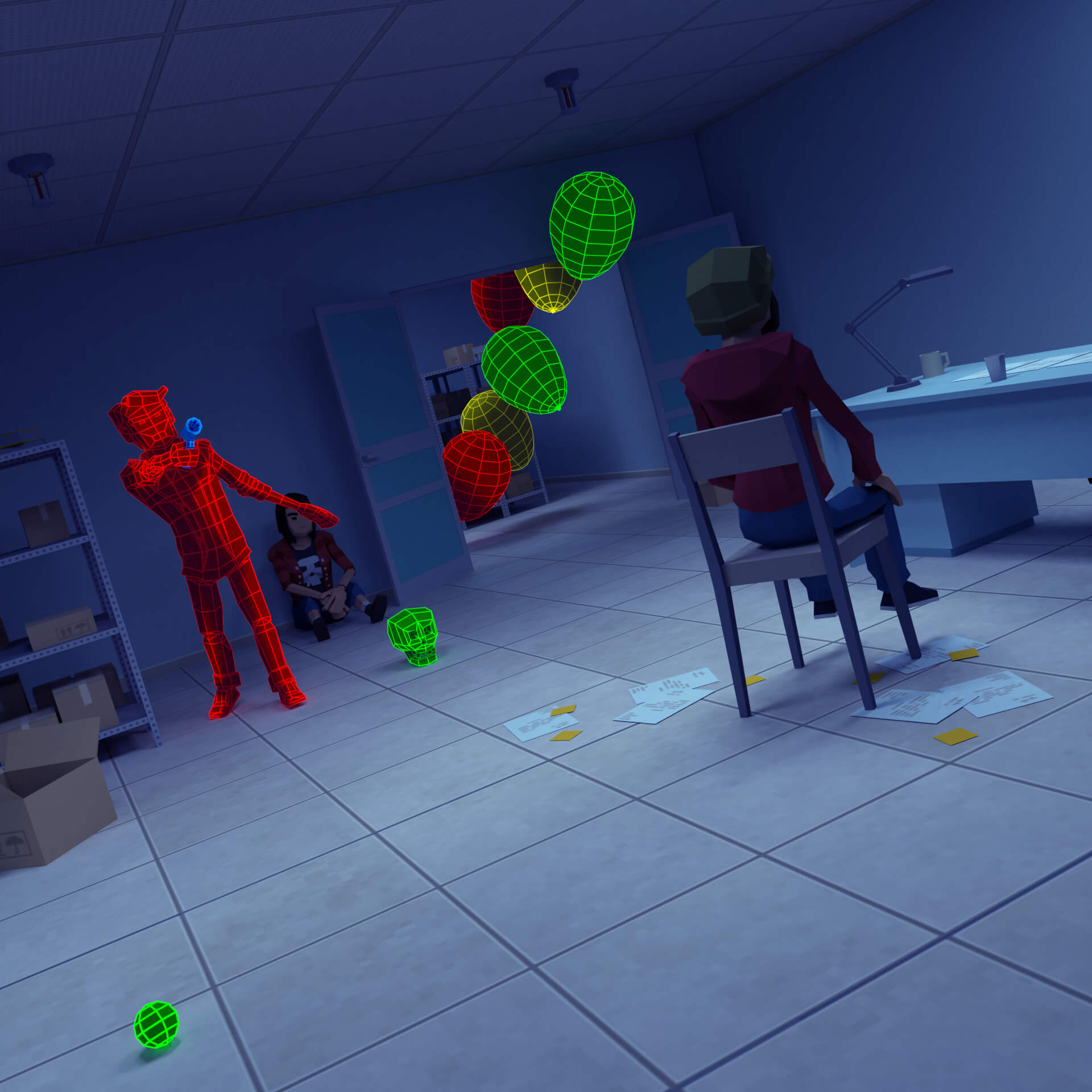
Still Life is a short film I made over the last year or so. I’m pretty happy with how it turned out and love the xylophone music Heather made for it. 😛
ZomBerry Commercial
I’ve finally finished that ZomBerry Commercial I’ve been working on!
Continue reading “ZomBerry Commercial”ZomBerry Box
For some reason it seemed like a good idea to make a ZomBerry Box so here we are. The solvable maze on the back was neat to work on as well as designing how the actual bits of cereal would look.
Continue reading “ZomBerry Box”ZomBerry Test Animation
Here’s a test render of this ZomBerry character I’ve been messing around with using Lighting Boy Studio’s shader and Auto-Rig Pro. I figure the Thriller dance is probably as good of a rigging test as anything, right?
Continue reading “ZomBerry Test Animation”Cat Flip Book Progress
Some quick progress shots of the cat flip books I made last week. The animation was done in Blender using its Grease Pencil tool. Drawing with a mouse isn’t great so I used Astropad and an iPad to make drawing quite a bit easier. The pages were printed on a card stock by the old HP LaserJet printer my friend Keeley gave me a while ago. The holes were made using a screw punch and plain old string was used for the binding.
These were a lot of fun to make and I’m pretty excited to see what folks do with them. Heather said she was going to color hers — which will be neat to see. 🙂
Felt-tipped Marksman
Felt-tipped Marksman is a Flash animation I did about ten years ago. I assumed the files were lost forever when I didn’t see them on the old hard drive I was going through the other week. I was over the moon when I found them hiding in my Dropbox folder when I was tidying that up the other day! I really need to go through more of my junk drawer folders and see what other goodies are laying around.
Studiobots
This is a bit of a throwback. I was going through an old hard drive and found this animation I did while I was at Studiobanks. From what I remember this was used as a commercial/promo for Studiobanks that played at the ADDY Awards in 2008.
My bud Keeley Carrigan did all of the character designs which were apart of a t-shirt/sticker/mural branding thingie we were doing at the studio at the time. In our office’s foyer we had a huge vinyl decal made of his design that was really something to see.
A wooden background was actually a design element we used in all of the company’s branding. In fact, a wood background was used in almost every version of studiobanks.com that we made.
It was really neat seeing this again. I had a lot of fun working with Banks and all of those dudes for that chunk of my life.
